 syncfusion
JavaScript Notification Controls
What's Included in the JavaScript Notification Package
The JavaScript Notification package includes the following list of controls.
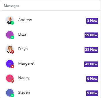
JavaScript Badge
The Javascript Badge control is a pure CSS control used to add notifications, messages, or statuses in different shapes and sizes. The Badge control can be easily integrated with ListView, Avatar, and other container controls.
Getting Started . Online demos . Learn more
Key features
- Types - Provided 8 different types of Badges.
- Predefined colors - Provided 8 predefined situational colors of Badges.
- Position - Supports 3 different positions, such as
default,topandbottom.
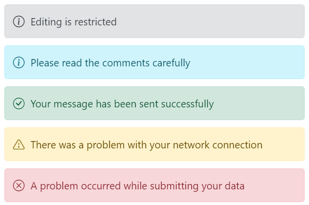
JavaScript Message
The JavaScript Message control is a graphical user interface for displaying messages with visual severity levels. It differentiates messages with icons and colors to denote the importance and context of the message.
Getting Started . Online demos . Learn more
Key features
- Severity - Provides an option to display the message with distinctive icons and colors based on the severity type. The available severity types such as Normal, Success, Info, Warning, and Error.
- Variants - Provides an option to display the message with predefined appearance variants. The available variants such as Text, Outlined, and Filled.
- Visibility - Provides an option to show or hide the message.
- Template - Provides an option to customize the content of the message.
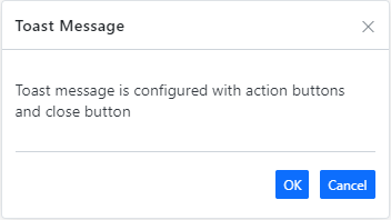
JavaScript Toast
The JavaScript Toast control is a small, non-blocking notification pop-up. It is a readable message displayed at the bottom of the screen or at a specific target and disappears automatically after a few seconds (time out) with different animation effects.
Getting Started . Online demos . Learn more
Key features
- Position - Enables to position the toast anywhere on the screen. It has a predefined set of positions and custom inputs for position based on the target.
- Autohide and Timeout - Toast can be expired based on the timeOut property; it hides toast automatically when reaches specific time without user interaction.
- Multi toast - Toasts can support to display multiple toasts with various time delay.
- Progress bar - Supports to visually indicate time lapse when the toast expires.
- Action buttons - Supports to add buttons in the toast for archiving any actions within the toast.
- Template - User customized element can be defined for the toast using the template property.
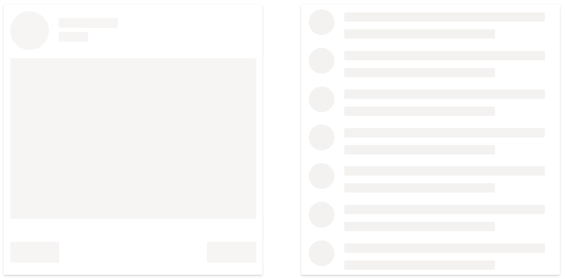
JavaScript Skeleton
The JavaScript Skeleton control is a placeholder that animates a shimmer effect to let users know that the page’s content is currently loading. It has several built-in features such as support for shapes, shimmer effect, and UI customization.
Getting Started . Online demos . Learn more
Key features
- Shapes - Provides various built-in shape variants to design the layout of the page.
- ShimmerEffect - Provides an option to display the skeleton with various animation effects.
- Styles - Customize the style of a skeleton.
Trusted by the world's leading companies

Setup
To install notifications and its dependent packages, use the following command,
npm install @syncfusion/ej2-notificationsSupported frameworks
Notification controls are also offered to following list of frameworks.
 Angular |
 React |
 Vue |
 ASP.NET Core |
 ASP.NET MVC |
|---|---|---|---|---|
Showcase samples
Support
Product support is available through following mediums.
- Support ticket - Guaranteed Response in 24 hours | Unlimited tickets | Holiday support
- Community forum
- GitHub issues
- Request feature or report bug
- Live chat
Changelog
Check the changelog here. Get minor improvements and bug fixes every week to stay up to date with frequent updates.
License and copyright
This is a commercial product and requires a paid license for possession or use. Syncfusion’s licensed software, including this component, is subject to the terms and conditions of Syncfusion's EULA. To acquire a license for 80+ JavaScript UI controls, you can purchase or start a free 30-day trial.
A free community license is also available for companies and individuals whose organizations have less than $1 million USD in annual gross revenue and five or fewer developers.
See LICENSE FILE for more info.
© Copyright 2025 Syncfusion® Inc. All Rights Reserved. The Syncfusion® Essential Studio® license and copyright applies to this distribution.