 guilhermerodz
The only accessible & unstyled & full featured Input OTP component in the Web.
OTP Input for React 🔐 by @guilhermerodz
https://github.com/guilhermerodz/input-otp/assets/10366880/753751f5-eda8-4145-a4b9-7ef51ca5e453
Usage
npm install input-otpThen import the component.
+'use client'
+import { OTPInput } from 'input-otp'

function MyForm() {
  return <form>
+   <OTPInput maxLength={6} render={({slots})  => (...)} />
  </form>
}
Default example
The example below uses tailwindcss @shadcn/ui tailwind-merge clsx:
'use client'
import { OTPInput, SlotProps } from 'input-otp'
<OTPInput
  maxLength={6}
  containerClassName="group flex items-center has-[:disabled]:opacity-30"
  render={({ slots }) => (
    <>
      <div className="flex">
        {slots.slice(0, 3).map((slot, idx) => (
          <Slot key={idx} {...slot} />
        ))}
      </div>

      <FakeDash />

      <div className="flex">
        {slots.slice(3).map((slot, idx) => (
          <Slot key={idx} {...slot} />
        ))}
      </div>
    </>
  )}
/>

// Feel free to copy. Uses @shadcn/ui tailwind colors.
function Slot(props: SlotProps) {
  return (
    <div
      className={cn(
        'relative w-10 h-14 text-[2rem]',
        'flex items-center justify-center',
        'transition-all duration-300',
        'border-border border-y border-r first:border-l first:rounded-l-md last:rounded-r-md',
        'group-hover:border-accent-foreground/20 group-focus-within:border-accent-foreground/20',
        'outline outline-0 outline-accent-foreground/20',
        { 'outline-4 outline-accent-foreground': props.isActive },
      )}
    >
      <div className="group-has-[input[data-input-otp-placeholder-shown]]:opacity-20">
        {props.char ?? props.placeholderChar}
      </div>
      {props.hasFakeCaret && <FakeCaret />}
    </div>
  )
}

// You can emulate a fake textbox caret!
function FakeCaret() {
  return (
    <div className="absolute pointer-events-none inset-0 flex items-center justify-center animate-caret-blink">
      <div className="w-px h-8 bg-white" />
    </div>
  )
}

// Inspired by Stripe's MFA input.
function FakeDash() {
  return (
    <div className="flex w-10 justify-center items-center">
      <div className="w-3 h-1 rounded-full bg-border" />
    </div>
  )
}

// tailwind.config.ts for the blinking caret animation.
const config = {
  theme: {
    extend: {
      keyframes: {
        'caret-blink': {
          '0%,70%,100%': { opacity: '1' },
          '20%,50%': { opacity: '0' },
        },
      },
      animation: {
        'caret-blink': 'caret-blink 1.2s ease-out infinite',
      },
    },
  },
}

// Small utility to merge class names.
import { clsx } from 'clsx'
import { twMerge } from 'tailwind-merge'

import type { ClassValue } from 'clsx'

export function cn(...inputs: ClassValue[]) {
  return twMerge(clsx(inputs))
}
How it works
There's currently no native OTP/2FA/MFA input in HTML, which means people are either going with 1. a simple input design or 2. custom designs like this one.
This library works by rendering an invisible input as a sibling of the slots, contained by a relatively positioned parent (the container root called OTPInput).
Features
This is the most complete OTP input on the web. It's fully featured
<summary>Supports iOS + Android copy-paste-cut</summary>
https://github.com/guilhermerodz/input-otp/assets/10366880/bdbdc96a-23da-4e89-bff8-990e6a1c4c23
<summary>Automatic OTP code retrieval from transport (e.g SMS)</summary>
By default, this input uses
autocomplete='one-time-code' and it works as it's a single input.
https://github.com/guilhermerodz/input-otp/assets/10366880/5705dac6-9159-443b-9c27-b52e93c60ea8
<summary>Supports screen readers (a11y)</summary>
Stripe was my first inspiration to build this library.
Take a look at Stripe's input. The screen reader does not behave like it normally should on a normal single input.
That's because Stripe's solution is to render a 1-digit input with "clone-divs" rendering a single char per div.
https://github.com/guilhermerodz/input-otp/assets/10366880/3d127aef-147c-4f28-9f6c-57a357a802d0
So we're rendering a single input with invisible/transparent colors instead.
The screen reader now gets to read it, but there is no appearance. Feel free to build whatever UI you want:
https://github.com/guilhermerodz/input-otp/assets/10366880/718710f0-2198-418c-8fa0-46c05ae5475d
<summary>Supports all keybindings</summary>
Should be able to support all keybindings of a common text input as it's an input.
https://github.com/guilhermerodz/input-otp/assets/10366880/185985c0-af64-48eb-92f9-2e59be9eb78f
<summary>Automatically optimizes for password managers</summary>
For password managers such as LastPass, 1Password, Dashlane or Bitwarden, 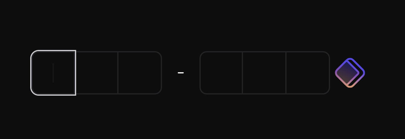 - This feature is optional and it's enabled by default. You can disable this optimization by adding
input-otp will automatically detect them in the page and increase input width by ~40px to trick the password manager's browser extension and prevent the badge from rendering to the last/right slot of the input.
pushPasswordManagerStrategy="none".
- This feature does not cause visible layout shift.
### Auto tracks if the input has space in the right side for the badge
https://github.com/guilhermerodz/input-otp/assets/10366880/bf01af88-1f82-463e-adf4-54a737a92f59
API Reference
OTPInput
The root container. Define settings for the input via props. Then, use the render prop to create the slots.
Props
type OTPInputProps = {
  // The number of slots
  maxLength: number

  // Render function creating the slots
  render: (props: RenderProps) => React.ReactElement
  // PS: Render prop is mandatory, except in cases
  // you'd like to consume the original Context API.
  // (search for Context in this docs)

  // The class name for the root container
  containerClassName?: string

  // Value state controlling the input
  value?: string
  // Setter for the controlled value (or callback for uncontrolled value)
  onChange?: (newValue: string) => unknown

  // Callback when the input is complete
  onComplete?: (...args: any[]) => unknown

  // Where is the text located within the input
  // Affects click-holding or long-press behavior
  // Default: 'left'
  textAlign?: 'left' | 'center' | 'right'

  // Virtual keyboard appearance on mobile
  // Default: 'numeric'
  inputMode?: 'numeric' | 'text' | 'decimal' | 'tel' | 'search' | 'email' | 'url'

  // Pro tip: input-otp export some patterns by default such as REGEXP_ONLY_DIGITS which you can import from the same library path
  // Example: import { REGEXP_ONLY_DIGITS } from 'input-otp';
  // Then use it as: <OTPInput pattern={REGEXP_ONLY_DIGITS}>
  pattern?: string

  // While rendering the input slot, you can access both the char and the placeholder, if there's one and it's active.
  placeholder?: string

  // Transfomer function that allows pasting, for example, "XXX-XXX" even though the input's regex/pattern doesn't allow hyphen and its max length is 6.
  // Example: (pasted) => pasted.replaceAll('-', '')
  pasteTransformer?: (pastedText: string) => string

  // Enabled by default, it's an optional
  // strategy for detecting Password Managers
  // in the page and then shifting their
  // badges to the right side, outside the input.
  pushPasswordManagerStrategy?:
    | 'increase-width'
    | 'none'

  // Enabled by default, it's an optional
  // fallback for pages without JS.
  // This is a CSS string. Write your own
  // rules that will be applied as soon as
  // <noscript> is parsed for no-js pages.
  // Use `null` to disable any no-js fallback (not recommended).
  // Default: `
  // [data-input-otp] {
  //   --nojs-bg: white !important;
  //   --nojs-fg: black !important;
  //
  //   background-color: var(--nojs-bg) !important;
  //   color: var(--nojs-fg) !important;
  //   caret-color: var(--nojs-fg) !important;
  //   letter-spacing: .25em !important;
  //   text-align: center !important;
  //   border: 1px solid var(--nojs-fg) !important;
  //   border-radius: 4px !important;
  //   width: 100% !important;
  // }
  // @media (prefers-color-scheme: dark) {
  //   [data-input-otp] {
  //     --nojs-bg: black !important;
  //     --nojs-fg: white !important;
  //   }
  // }`
  noScriptCSSFallback?: string | null
}
Examples
<summary>Automatic form submission on OTP completion</summary>
tsx
export default function Page() {
  const formRef = useRef<HTMLFormElement>(null)
  const buttonRef = useRef<HTMLButtonElement>(null)

  return (
    <form ref={formRef}>
      <OTPInput
        // ... automatically submit the form
        onComplete={() => formRef.current?.submit()}
        // ... or focus the button like as you wish
        onComplete={() => buttonRef.current?.focus()}
      />

      <button ref={buttonRef}>Submit</button>
    </form>
  )
}
<summary>Automatically focus the input when the page loads</summary>
tsx
export default function Page() {
  return (
    <form ref={formRef}>
      <OTPInput
        autoFocus
        // Pro tip: accepts all common HTML input props...
      />
    </form>
  )
}
<summary>Usage with react-hook-form</summary>
Just use it as a regular text input:
tsx
const { register, handleSubmit } = useForm();
// Then register it like a text input
<InputOTP {...register("otp")} />
You can also use react-hook-form's Controller if needed:
tsx
const { control } = useForm();
// Then control it like a text input
<Controller
  name="customOTP"
  control={control}
  defaultValue=""
  render={({ field }) => (
    <OTPInput
      {...field}
      label="Custom OTP"
    />
  )}
/>
Caveats
<summary>[Workaround] If you want to block specific password manager/badges:</summary>
By default,
input-otp handles password managers for you.
The password manager badges should be automatically shifted to the right side.
However, if you still want to block password managers, please disable the pushPasswordManagerStrategy and then manually block each PWM.
diff
<OTPInput
  // First, disable library's built-in strategy
  // for shifting badges automatically
- pushPasswordManagerStrategy="increase-width"
+ pushPasswordManagerStrategy="none"
  // Then, manually add specifics attributes
  // your password manager docs
  // Example: block LastPass
+ data-lpignore="true"
  // Example: block 1Password
+ data-1p-ignore="true"
/>
<summary>[Setting] If you want to customize the
noscript CSS fallback</summary>
By default, input-otp handles cases where JS is not in the page by applying custom CSS styles.
If you do not like the fallback design and want to apply it to your own, just pass a prop:
diff
// This is the default CSS fallback.
// Feel free to change it entirely and apply to your design system.
const NOSCRIPT_CSS_FALLBACK = `
[data-input-otp] {
  --nojs-bg: white !important;
  --nojs-fg: black !important;

  background-color: var(--nojs-bg) !important;
  color: var(--nojs-fg) !important;
  caret-color: var(--nojs-fg) !important;
  letter-spacing: .25em !important;
  text-align: center !important;
  border: 1px solid var(--nojs-fg) !important;
  border-radius: 4px !important;
  width: 100% !important;
}
@media (prefers-color-scheme: dark) {
  [data-input-otp] {
    --nojs-bg: black !important;
    --nojs-fg: white !important;
  }
}`

<OTPInput
  // Pass your own custom styles for when JS is disabled
+ noScriptCSSFallback={NOSCRIPT_CSS_FALLBACK}
/>
<summary>[Workaround] If you're experiencing an unwanted border on input focus:</summary>
diff
<OTPInput
  // Add class to the input itself
+ className="focus-visible:ring-0"
  // Not the container
  containerClassName="..."
/>
<summary>[Not Recommended] If you want to centralize input text/selection, use the 


textAlign prop:</summary>
diff
<OTPInput
  // customizable but not recommended
+ textAlign="center"
/>
NOTE: this also affects the selected caret position after a touch/click.
textAlign="left"
textAlign="center"
textAlign="right"
<summary>If you want to use Context props:</summary>
diff
+import { OTPInputContext } from 'input-otp'

function MyForm() {
  return (
    <OTPInput
-     // First remove the `render` prop
-     render={...}
    >
      <OTPInputWrapper />
    </OTPInput>
  )
}

+function OTPInputWrapper() {
+ const inputContext = React.useContext(OTPInputContext)
+ return (
+   <>
+     {inputContext.slots.map((slot, idx) => (
+       <Slot key={idx} {...slot} />
+     ))}
+   </>
+ )
+}
NOTE: this also affects the selected caret position after a touch/click.
textAlign="left"
textAlign="center"
textAlign="right"
<summary>[DX] Add Tailwind autocomplete for
containerClassname attribute in VS Code.</summary>
Add the following setting to your .vscode/settings.json:
diff
{
  "tailwindCSS.classAttributes": [
    "class",
    "className",
+   ".*ClassName"
  ]
}