react-native-otp-entry
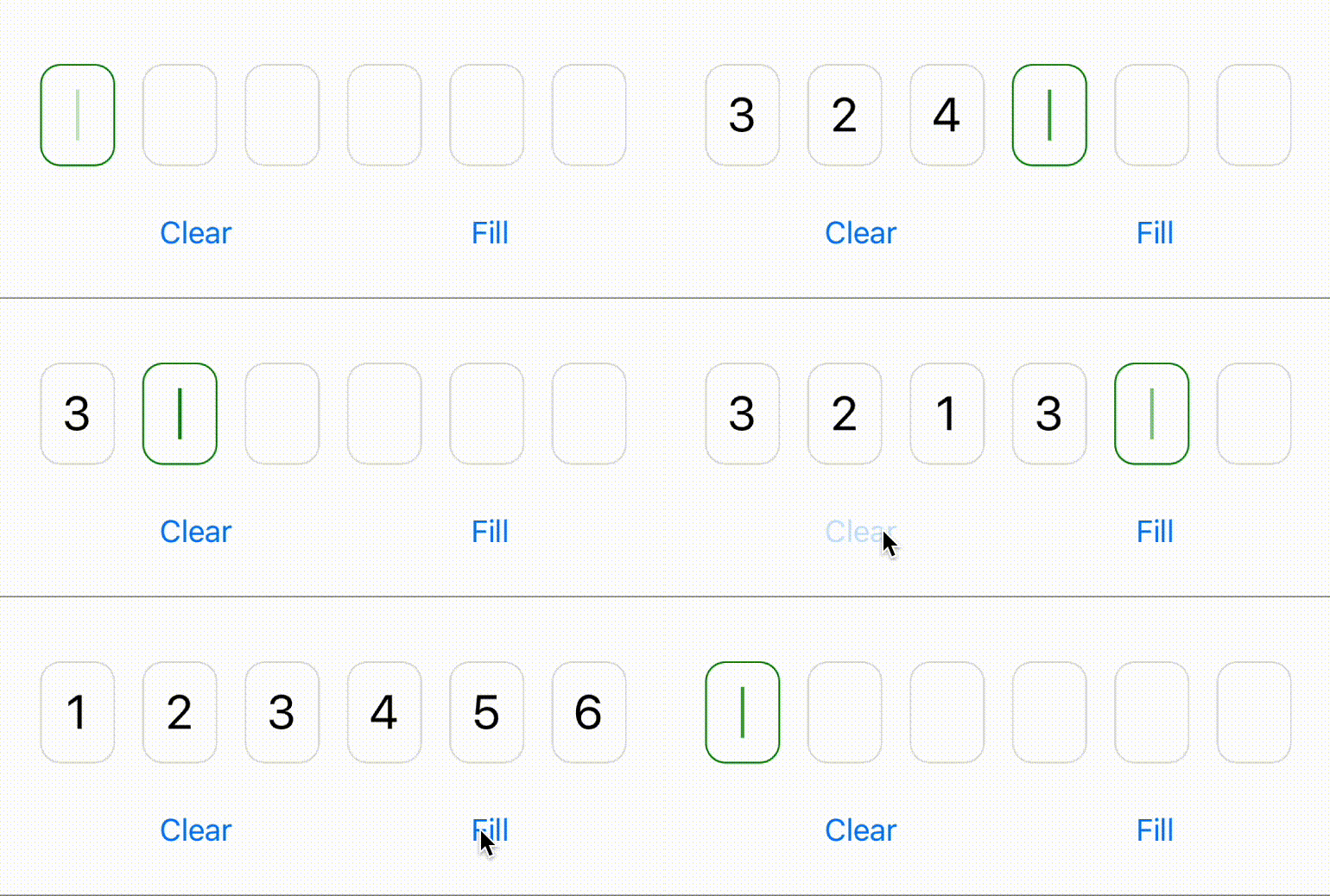
react-native-otp-entry is a simple and highly customizable React Native component for entering OTP (One-Time Password) on iOS, Android, and Web. It provides an intuitive and user-friendly interface for inputting one-time passwords in your React Native applications.
Looking for a Phone Number input component? Check out react-native-phone-entry - a simple and fully modifiable Phone Number Input Component for React Native that provides an intuitive interface for entering and validating international phone numbers.

Features
- Simple and easy-to-use OTP input component.
- Highly customizable appearance and styling.
- Supports autofill
- Effortlessly integrates with React Native, Expo, and React Native Web platforms.
- Fully typed with TypeScript.
- Fully covered with unit tests.
- Paste functionality.
Demo
Try out React Native OTP Entry in action on Snack Expo:
or https://snack.expo.dev/@anday013/demo-react-native-otp-entry
Installation
Install react-native-otp-entry using npm or yarn:
npm install react-native-otp-entry

# or

yarn add react-native-otp-entry
Usage
Import the
OtpInputcomponent fromreact-native-otp-entry:import { OtpInput } from "react-native-otp-entry";Render the
OtpInputcomponent in your screen/component:<OtpInput numberOfDigits={6} onTextChange={(text) => console.log(text)} />Customize the styling as per your requirements:
<OtpInput
  numberOfDigits={6}
  focusColor="green"
  autoFocus={false}
  hideStick={true}
  placeholder="******"
  blurOnFilled={true}
  disabled={false}
  type="numeric"
  secureTextEntry={false}
  focusStickBlinkingDuration={500}
  onFocus={() => console.log("Focused")}
  onBlur={() => console.log("Blurred")}
  onTextChange={(text) => console.log(text)}
  onFilled={(text) => console.log(`OTP is ${text}`)}
  textInputProps={{
    accessibilityLabel: "One-Time Password",
  }}
  textProps={{
    accessibilityRole: "text",
    accessibilityLabel: "OTP digit",
    allowFontScaling: false,
  }}
  theme={{
    containerStyle: styles.container,
    pinCodeContainerStyle: styles.pinCodeContainer,
    pinCodeTextStyle: styles.pinCodeText,
    focusStickStyle: styles.focusStick,
    focusedPinCodeContainerStyle: styles.activePinCodeContainer,
    placeholderTextStyle: styles.placeholderText,
    filledPinCodeContainerStyle: styles.filledPinCodeContainer,
    disabledPinCodeContainerStyle: styles.disabledPinCodeContainer,
  }}
/>
Props
The react-native-otp-entry component accepts the following props:
| Prop | Type | Description | ||
|---|---|---|---|---|
numberOfDigits |
number | The number of digits to be displayed in the OTP entry. | ||
theme |
Theme | Custom styles for each element. (See below) | ||
textInputProps |
TextInputProps | Extra props passed to underlying hidden TextInput (see: https://reactnative.dev/docs/textinput) | ||
textProps |
TextProps | Props passed to the Text component that renders each digit (see: https://reactnative.dev/docs/text) | ||
autoFocus |
boolean | Default: true. Sets autofocus. | ||
focusColor |
ColorValue | The color of the input field border and stick when it is focused. | ||
placeholder |
string | Placeholder value to the input. | ||
onTextChange |
(text: string) => void | A callback function is invoked when the OTP text changes. It receives the updated text as an argument. | ||
onFilled |
(text: string) => void | A callback function is invoked when the OTP input is fully filled. It receives a full otp code as an argument. | ||
blurOnFilled |
boolean | Default: false. Blurs (unfocuses) the input when the OTP input is fully filled. | ||
hideStick |
boolean | Default: false. Hides cursor of the focused input. | ||
focusStickBlinkingDuration |
number | The duration (in milliseconds) for the focus stick to blink. | ||
disabled |
boolean | Default: false. Disables the input | ||
type |
'alpha' \ | 'numeric' \ | 'alphanumeric' | The type of input. 'alpha': letters only, 'numeric': numbers only, 'alphanumeric': letters or numbers. |
secureTextEntry |
boolean | Default: false. Obscures the text entered so that sensitive text like PIN stay secure. | ||
onFocus |
() => void | A callback function is invoked when the OTP input is focused. | ||
onBlur |
() => void | A callback function is invoked when the OTP input is blurred. |
| Theme | Type | Description |
|---|---|---|
containerStyle |
ViewStyle | Custom styles for the root View. |
pinCodeContainerStyle |
ViewStyle | Custom styles for the container that wraps each individual digit in the OTP entry. |
pinCodeTextStyle |
TextStyle | Custom styles for the text within each individual digit in the OTP entry. |
placeholderTextStyle |
TextStyle | Custom styles for the placeholder text within each individual digit in the OTP entry. |
focusStickStyle |
ViewStyle | Custom styles for the focus stick, which indicates the focused input field. |
focusedPinCodeContainerStyle |
ViewStyle | Custom styles for the input field when it is focused. |
filledPinCodeContainerStyle |
ViewStyle | Custom styles for the input field when it has a value. |
disabledPinCodeContainerStyle |
ViewStyle | Custom styles for the input field when it is disabled. |
Note: The ViewStyle and TextStyle types are imported from react-native and represent the style objects used in React Native for views and text, respectively.
Tip: If you have difficulties while applying gap or in any other style property to set a suitable space between the OTP input containers, please set the width in containerStyle to 'auto' or undefined, as it is been set to '100%' by default.
Ref
The react-native-otp-entry component exposes these functions with ref:
| Prop | Type | Description |
|---|---|---|
clear |
() => void; | Clears the value of the OTP input. |
focus |
() => void; | Focus of the OTP input. |
blur |
() => void; | Blurs the OTP input. |
setValue |
(value: string) => void; | Sets the value of the OTP input. |
License
This project is licensed under the MIT License.
Contributing
Contributions are welcome! Please feel free to open issues or submit pull requests.
If you find a bug or have any feature requests, please open an issue :)
Support Me
If you find this project helpful and want to support my work, consider buying me a coffee! ☕


